Satechi Stand and Hub for Mac Mini/Studio
The Storage Upgrade Apple Should Have Made Standard
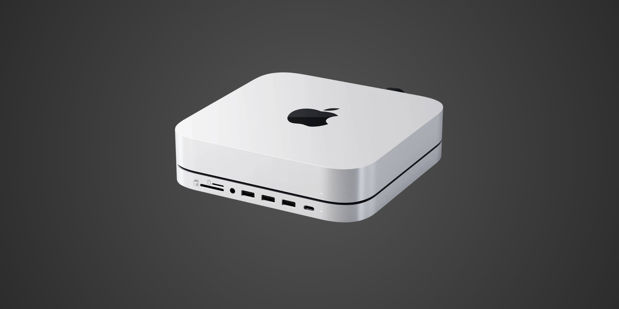
Table of Contents
Introduction
If you own a Mac Mini M1, M2, or Mac Studio, you've probably already bumped into Apple's most frustrating limitation—that base 256GB or 512GB of storage feels inadequate before you've even finished setting up your machine. Upgrading at purchase time? That's where Apple really gets you, charging $200 to jump from 256GB to 512GB and a wallet-crushing $600 to reach 1TB on the Mac Studio. The Satechi Stand and Hub for Mac Mini/Studio with NVMe SSD Enclosure arrives as a compelling answer to this universal frustration, offering a clever two-in-one solution that both elevates your Mac and provides expandable storage at a fraction of Apple's upgrade costs. Available for $99, this aluminum stand transforms your Mac Mini or Studio into a more accessible workstation while housing an M.2 NVMe or SATA SSD enclosure that accepts drives up to 4TB. Compatible with Mac Mini M1 2020, M2 and M2 Pro 2023 models, plus Mac Studio 2022 and 2023 versions, the Stand and Hub targets users who refuse to play Apple's expensive storage game and want front-facing ports that should have been standard from the start.
Product Overview
The Satechi Stand and Hub is built around a patented design that functions simultaneously as an elevating platform and seven-port expansion hub, all connecting through a single USB-C 3.2 Gen 2 cable to one of your Mac's Thunderbolt ports. This isn't just any generic hub slapped under your computer—it's specifically engineered to match Apple's industrial design language while addressing the Mac Mini and Studio's most glaring limitations.
Measuring 7.8 x 7.8 x 0.9 inches and weighing 0.93 pounds, the Stand and Hub matches the footprint of the Mac Mini and Studio perfectly, sitting underneath like it shipped that way from Cupertino. Satechi wraps this functionality in brushed aluminum that mirrors Apple's signature finish, available in Silver to complement current Mac Mini and Studio models. The construction feels substantial, with tight tolerances and a solid build that suggests this is designed to support your Mac for years, not months.
The stand elevates your Mac approximately 0.9 inches off your desk surface, creating crucial airflow underneath while positioning the bottom air intake properly—something you absolutely need given how warm these machines can run under load. Strategic ventilation slots on the sides promote additional cooling, ensuring your Mac doesn't cook itself while perched on the stand. The patented single-cable design routes the USB-C connection through the back, maintaining that clean aesthetic Apple users demand while keeping cable clutter to a minimum.
Front-facing connectivity includes one USB-C 3.2 Gen 2 port delivering 10Gbps data transfer speeds, three USB-A ports with varying speeds including one USB-A 3.2 Gen 2 at 10Gbps and two USB-A 3.0 ports at 5Gbps, microSD and SD card readers supporting UHS-I speeds up to 104MB/s, and a 3.5mm headphone jack. These ports bring essential connectivity to where you can actually reach it, eliminating the awkward reach behind your Mac every time you need to plug something in.
The standout feature lives on the underside—an internal M.2 SSD enclosure that accepts both NVMe PCIe and M.2 SATA solid-state drives in 2230, 2242, 2260, and 2280 form factors, supporting capacities up to 4TB. Satechi includes the necessary screw and screwdriver for SSD installation, plus a thermal pad to manage heat dissipation. The SSD connects through the same USB-C 3.2 Gen 2 interface, capable of transfer speeds up to 10Gbps for NVMe drives or 6Gbps for SATA drives. This enclosure transforms what would be expensive internal Apple storage into affordable external capacity you can upgrade or replace anytime.
Satechi backs the Stand and Hub with a two-year limited warranty against defects in materials and workmanship, a reasonable coverage period that reflects confidence in the build quality while acknowledging this is a $99 accessory, not a $300 premium dock.
Performance and Real-World Speed
Satechi claims the Stand and Hub's USB-C 3.2 Gen 2 connection delivers transfer speeds up to 10Gbps for NVMe SSDs and 6Gbps for M.2 SATA drives, which translates to theoretical maximum sequential read and write speeds around 1,250MB/s and 750MB/s respectively when accounting for USB overhead. In real-world testing conducted by multiple reviewers using high-performance NVMe drives like the Western Digital SN850X, the Stand and Hub consistently delivered over 1GBps write speeds and nearly 900MBps read speeds—impressive considering the USB-C bottleneck compared to internal PCIe connections.
A 1TB file transfer from the Mac's internal storage to an installed NVMe SSD in the enclosure completes in approximately 15 to 20 minutes depending on file types and fragmentation, sustained at speeds around 800 to 900MBps throughout. Moving large video project files or photo libraries happens fast enough that you're not sitting there watching progress bars crawl, though it's obviously slower than the 7,000MB/s speeds you'd see from the Mac's internal SSD. For Time Machine backups, the enclosure handles incremental backups smoothly, with initial full backups of a 256GB system completing in roughly 30 to 40 minutes.
The card readers perform adequately for their UHS-I specification, maxing out around 90 to 104MB/s when transferring photos and video from SD cards. This means importing a 64GB card filled with 4K video footage takes approximately 10 to 12 minutes, which isn't blazing fast but matches what you'd expect from UHS-I hardware. The USB-A ports deliver their rated speeds reliably, with the 10Gbps port handling external SSD transfers at full speed while the 5Gbps ports work fine for peripherals like keyboards, mice, and slower storage devices.
Where the Stand and Hub shows its limitations is in power delivery and device charging—there essentially isn't any beyond what's needed for data transfer. The USB ports are data-only, unable to charge iPads or provide significant power to bus-powered devices, and Satechi explicitly recommends connecting only one bus-powered peripheral at a time. The shared 15-watt power budget means an installed SSD consumes about 7.5 watts, leaving minimal overhead for anything else. This design choice keeps costs down but means you can't use the Stand and Hub as a charging station for your devices.
Build Quality and Durability
Satechi's reputation for matching Apple's aesthetic precision shows immediately when you unbox the Stand and Hub. The brushed aluminum finish doesn't just approximate Apple's industrial design—it genuinely complements it, with a color match and surface texture that makes the hub look like an official accessory rather than a third-party add-on. The manufacturing tolerances are tight, with the Mac Mini or Studio sitting flush on the stand with minimal play or movement. Reviewers consistently note the hub feels like it could have shipped from Apple itself, which is high praise considering Cupertino's obsessive attention to detail.
The aluminum construction serves dual purposes beyond aesthetics. First, it acts as a passive heatsink for the internal SSD enclosure, helping dissipate heat generated during sustained transfers. Second, it provides structural rigidity that prevents flexing or warping under the weight of your Mac, which can exceed five pounds for a fully loaded Mac Studio. The ventilation slots are precisely machined, promoting airflow without creating weak points in the structure. After months of continuous use, reviewers report no degradation in fit or finish, no loose connections, and no thermal issues even with demanding NVMe drives installed.
The single USB-C cable connecting the hub to your Mac uses a reasonably flexible design that doesn't create strain on the port, though some users note the cable length and routing can be slightly awkward depending on which port you choose on the Mac Mini's back panel. Once installed, the connection feels secure with no intermittent disconnections or power cycling issues, which plagued some competing hubs. The patented cable management system keeps everything clean, though you give up one of your Mac's valuable Thunderbolt 4 ports for what's essentially a USB 3.2 Gen 2 connection—something worth considering if you need maximum Thunderbolt bandwidth for displays or external GPU enclosures.
Installing an SSD in the enclosure is straightforward, taking about five minutes with the included screwdriver and screw. The thermal pad placement is clearly marked, and the M.2 slot accepts drives without excessive force or finicky alignment. The access panel on the bottom uses a simple screw-on design rather than clips or magnets, ensuring long-term reliability but requiring you to flip your Mac and hub over for drive installation or replacement. For users who swap drives frequently, this becomes mildly annoying, but for most who install once and forget about it, the secure mounting is preferable to more convenient but less stable alternatives.
The two-year warranty provides reasonable coverage for a $99 accessory, though it's worth noting this is half the protection period you'd get from premium Thunderbolt docks in the $200 to $300 range. Satechi's customer support receives generally positive marks from users who've needed assistance, with responsive communication and reasonable resolution times for legitimate defects. The company's established presence in the Mac accessory market since 2005 suggests they'll be around to honor warranty claims, unlike some fly-by-night Amazon brands flooding the market with suspiciously cheap alternatives.
Compatibility
The Satechi Stand and Hub for Mac Mini/Studio with NVMe SSD Enclosure is specifically and exclusively designed for Mac Mini M1 2020, Mac Mini M2 and M2 Pro 2023, Mac Studio 2022, and Mac Studio 2023 models, period. This is Mac-specific hardware that physically and electronically matches these exact computers, and attempting to use it with any other device will result in disappointment at best and potential damage at worst.
The Stand and Hub connects to your Mac through a single USB-C 3.2 Gen 2 connection, occupying one of the Mac Mini's or Studio's Thunderbolt 4 ports but operating at USB speeds rather than full 40Gbps Thunderbolt bandwidth. This means you're trading one of your high-speed Thunderbolt ports for seven lower-speed USB connections plus SSD storage, which makes sense for most users but represents a significant bandwidth sacrifice if you need multiple Thunderbolt devices like high-resolution displays, external GPUs, or professional audio interfaces. The hub shows up as a standard USB hub in macOS, requiring no drivers or special software beyond the initial formatting of any installed SSD.
For the internal SSD enclosure, compatibility extends to M.2 NVMe PCIe drives and M.2 SATA drives in 2230, 2242, 2260, and 2280 form factors, supporting capacities up to 4TB. Critically, you need to understand what this enclosure can and cannot do. The NVMe support represents a significant upgrade over Satechi's earlier version which only accepted SATA drives, giving you access to faster modern SSDs. You can install any standard M.2 NVMe or SATA drive, format it for macOS using Disk Utility, and use it for Time Machine backups, file storage, or even as a secondary boot drive, though Satechi recommends against running macOS from the enclosure due to the USB connection's limitations.
However, the enclosure cannot accommodate M.2 drives with pre-installed heatsinks—the internal clearance simply doesn't allow it. You also cannot use double-sided M.2 drives with NAND chips on both sides of the PCB, as the enclosure only provides space for single-sided drives. These limitations eliminate some high-capacity consumer drives but still leave plenty of compatible options from Samsung, Western Digital, Crucial, and other major manufacturers.
The Satechi Stand and Hub is absolutely not compatible with the new Mac Mini M4 or M4 Pro models released in late 2024, despite the similar form factor. Satechi has released a separate version specifically for the M4 generation with redesigned port placement and cooling, so attempting to force the M1/M2 version onto an M4 Mac will result in misaligned ports and potential blocking of the M4's unique bottom-mounted power button. You cannot use this stand with older 2018 Mac Mini models, any MacBook Pro or Air, iMac, Mac Pro, or Windows PCs, even if they have USB-C ports. This is Mac Mini and Mac Studio hardware built to Apple's exact specifications for these specific generations.
One crucial compatibility concern that's emerged through user reports involves the Mac Mini M2 and M2 Pro models specifically. Multiple users have reported issues with the SD card reader not mounting cards properly on M2 machines, despite the same hub working flawlessly on M1 models. Some users also report the hub only recognizing SD cards under 2GB when connected directly to M2 Mac Minis, requiring an intermediary USB-C hub between the Mac and the Satechi stand to work around the limitation. Satechi acknowledges these reports but hasn't provided a definitive solution, suggesting potential USB controller incompatibilities between Apple's M2 chip and the hub's hardware. This issue doesn't affect all M2 users, but it's prevalent enough that M2 owners should be prepared for potential troubleshooting or workarounds.
Strengths and Weaknesses
The Satechi Stand and Hub's greatest strength lies in its value proposition—for $99, you're getting a well-designed stand that solves multiple Mac Mini and Studio limitations simultaneously while potentially saving hundreds compared to Apple's storage upgrade prices. A 1TB NVMe SSD costs around $50 to $80 from reputable brands, meaning you can add 1TB of storage to your Mac for roughly $150 to $180 total, compared to Apple's $200 charge for upgrading from 256GB to 512GB internally or $600 for jumping to 1TB on the Mac Studio. The math gets even more compelling at 2TB, where you're spending approximately $230 to $280 total versus Apple's eye-watering upgrade costs.
The industrial design and build quality genuinely rival Apple's own accessories, with that color-matched brushed aluminum finish and precise fit making the hub feel like an official accessory rather than a third-party compromise. The seven-port expansion brings genuinely useful connectivity to the front of your Mac where you can actually reach it, eliminating the daily annoyance of reaching behind your machine to plug in SD cards, USB drives, or headphones. The single-cable connection keeps your desk clean, and the elevated design promotes proper airflow for your Mac's bottom intake, potentially extending its lifespan by preventing heat buildup.
The upgraded NVMe support in current versions represents a significant improvement over earlier SATA-only models, giving you access to faster modern drives and better future-proofing your investment. Transfer speeds through the USB-C 3.2 Gen 2 connection are genuinely impressive for external storage, with sustained writes over 1GBps making this viable for video editing scratch disks, photo libraries, and Time Machine backups without the performance penalty you'd see from mechanical drives or slower USB connections. The installation process is straightforward enough that non-technical users can handle it confidently, and the thermal management keeps drives cool even during sustained transfers.
However, the Satechi Stand and Hub isn't without notable limitations. The fundamental weakness affecting all Mac Mini hubs—both Satechi and competitors like UGREEN and IVANKY—is the trade-off of occupying a Thunderbolt 4 port to gain USB 3.2 Gen 2 connectivity. You're sacrificing 40Gbps Thunderbolt bandwidth for 10Gbps USB speeds, which matters significantly if you need multiple high-resolution displays, external GPUs, or professional Thunderbolt storage arrays. For users with simple needs, this trade-off makes sense, but power users might find themselves port-starved despite adding seven new connections.
The bus-powered design creates frustrating power limitations that affect real-world usability. With a shared 15-watt power budget and half of that consumed by an installed SSD, you're left with minimal power for peripherals. The USB ports cannot charge iPads, don't support Apple's SuperDrive, and Satechi explicitly recommends connecting only one bus-powered device at a time. For a hub positioning itself as a comprehensive expansion solution, the inability to charge devices feels like a significant oversight, especially when competing hubs like the UGREEN Revodok Max 213 include external power supplies to avoid these limitations. You're essentially getting data-only ports, which diminishes their utility considerably.
The Mac Mini M2 and M2 Pro compatibility issues with SD card readers represent an unresolved problem that Satechi hasn't adequately addressed. Multiple users report card mounting failures, storage size limitations under 2GB, or requiring workaround solutions like intermediary hubs to function properly. For photographers and videographers who bought this hub specifically for the SD card reader, discovering it doesn't work reliably on their M2 Mac Mini creates legitimate frustration. Satechi's vague acknowledgment without providing firmware updates or hardware revisions suggests this might be a fundamental incompatibility that won't get fixed, leaving M2 owners gambling on whether their specific configuration will work.
The SSD enclosure's physical limitations restrict your drive options more than you'd expect. The inability to accommodate M.2 drives with pre-installed heatsinks or double-sided drives eliminates some popular high-capacity consumer models, requiring you to research compatibility carefully before purchasing. The bottom-mounted access panel means you need to flip your entire Mac setup over to install or replace drives, which becomes tedious if you swap drives frequently or need to troubleshoot connection issues.
The card reader speeds top out at UHS-I rates around 104MB/s, which feels borderline inadequate in 2024 when UHS-II cards capable of 300MB/s have been standard in professional cameras for years. Importing a 128GB card of 4K video footage takes 20-plus minutes at UHS-I speeds versus under 10 minutes with UHS-II, and that time adds up across multiple cards. For casual users importing vacation photos, this limitation barely matters, but for professionals working with video daily, it becomes a noticeable bottleneck that forces you to consider separate card readers anyway.
The real competition isn't between Satechi and direct competitors like UGREEN or IVANKY—their offerings are functionally similar with minor variations in port selection and pricing. The real competition is between buying any Mac Mini hub with SSD enclosure versus simply purchasing a standalone external SSD like the Samsung T7 or Crucial X9 and accepting the cable clutter. A 1TB Samsung T7 costs around $90, delivers similar performance, works with any computer not just your Mac, and doesn't occupy a Thunderbolt port permanently. You give up the integrated stand and front-facing ports, but you gain portability and flexibility. For users who value the all-in-one solution and clean desk aesthetic, Satechi wins. For budget-conscious users or those who might want to move their storage between machines, standalone external SSDs make more financial sense.
Verdict: Should You Buy It?
Buy this if:
- You own a Mac Mini M1 2020, M2 or M2 Pro 2023, Mac Studio 2022, or Mac Studio 2023 and refuse to pay Apple's outrageous storage upgrade prices
- You value a clean desk aesthetic and want front-facing ports you can actually reach without awkward contortions behind your machine
- You're comfortable with USB speeds rather than full Thunderbolt bandwidth for your expanded storage
- You don't need to charge devices through the hub's ports since they're data-only
- You're willing to accept that M2 Mac Mini owners might encounter SD card reader compatibility issues that require workarounds or simply don't plan to use that feature heavily anyway
Skip this if:
- You only need basic external storage without the integrated stand and would be better served by a standalone external SSD like the Samsung T7 that costs similar money but works with any device and travels easily
- You absolutely need to preserve all your Mac's Thunderbolt 4 ports for high-bandwidth devices like multiple 4K displays or professional audio interfaces where giving up 40Gbps for 10Gbps USB connectivity creates a significant bottleneck
- You require powered USB ports capable of charging iPads or running bus-powered devices reliably since the hub's 15-watt shared power budget creates frustrating limitations
- You own a Mac Mini M4 or M4 Pro since this version is explicitly incompatible and you need the separate M4-specific model instead
- You're an M2 Mac Mini owner who relies heavily on SD card imports and can't tolerate potential compatibility issues that multiple users have reported without clear solutions from Satechi