The Corsair MP600 Mini
Pocket-Sized Gen 4 Speed for Handhelds and Ultraportables
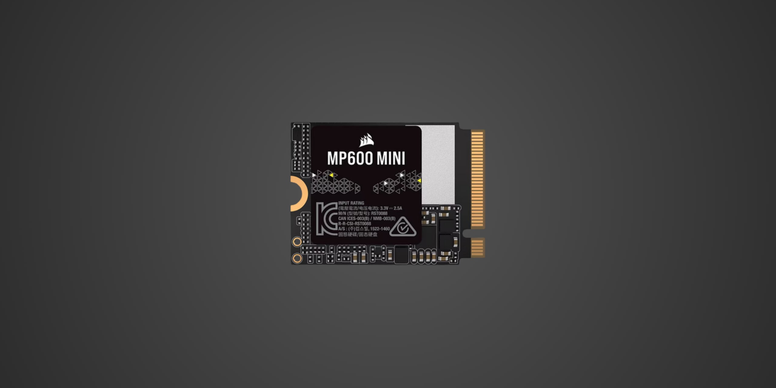
Table of Contents
Introduction
If you're wielding a Steam Deck, Microsoft Surface, or any ultracompact device and craving more storage without sacrificing performance, the Corsair MP600 Mini is built specifically for your world. This PCIe Gen 4 NVMe drive arrives in the diminutive M.2 2230 form factor, measuring just 30mm in length compared to the standard 80mm desktop drives. That tiny footprint doesn't compromise on speed, targeting handheld gamers who need to expand their library, content creators working on tablets, and system builders cramming performance into impossibly small chassis. In a market where 2230-sized drives often lag behind their full-size siblings, the MP600 Mini positions itself as a premium option that brings flagship-tier speeds to devices where every millimeter counts.
Product Overview
The MP600 Mini employs the compact M.2 2230 form factor, making it compatible with devices that physically cannot accommodate standard 2280 drives. Under the hood, it leverages a PCIe 4.0 x4 NVMe 1.4 interface, which means it can theoretically saturate the bandwidth available to Gen 4 systems. The drive uses high-density 3D TLC NAND technology, which strikes a balance between performance, endurance, and cost compared to cheaper QLC alternatives or premium MLC options. Corsair doesn't explicitly disclose the controller model in their specifications, which is common for compact drives where proprietary or semi-custom solutions often handle the heavy lifting.
The 2TB model weighs a mere 25 grams and ships with a thermal pad specifically designed for Microsoft Surface installations, acknowledging that heat management in ultracompact devices requires thoughtful solutions. The drive is also available in a 1TB capacity for those with tighter budgets or less demanding storage needs. There's no mention of DRAM cache in the official specs, suggesting the drive likely relies on Host Memory Buffer technology where it borrows a small portion of your system RAM to handle mapping tables. This is standard practice for compact drives and rarely causes performance issues in real-world handheld gaming or mobile productivity scenarios.
Performance & Real World Speed
Corsair rates the MP600 Mini at up to 7000 MB/s sequential read and up to 6200 MB/s sequential write, which puts it firmly in flagship Gen 4 territory. These numbers matter most when you're installing large games on your Steam Deck or transferring multi-gigabyte video projects on a Surface device. To put this in perspective, a 50GB game that would take about two minutes to transfer from a SATA SSD can complete in under 15 seconds when moving from another fast NVMe drive to the MP600 Mini.
Random performance figures check in at up to 750,000 IOPS for reads and up to 1,000,000 IOPS for writes, which translates to snappy application launches and responsive system behavior when shuffling between tasks. In practical terms, your Steam Deck will load game levels noticeably faster than the stock drive, and your Surface will feel more responsive when juggling multiple browser tabs, documents, and background processes.
The drive's compact size means less thermal mass to absorb heat, so sustained write operations like downloading multiple large games simultaneously may trigger thermal throttling sooner than a full-size desktop drive with a chunky heatsink. In typical handheld gaming sessions where you're reading data more than writing it, this rarely becomes a problem. However, if you're using this in a Surface for video editing and regularly ingesting footage from external sources, expect the drive to warm up during intensive transfers.
Thermal Management
Gen 4 drives inherently generate more heat than their Gen 3 predecessors, and squeezing that performance into a 2230 form factor concentrates the thermal challenge. The MP600 Mini ships with a thermal pad intended for Microsoft Surface installations, which helps conduct heat away from the NAND chips and controller to the device's chassis. This passive solution is adequate for most handheld scenarios where burst performance matters more than sustained maximum throughput.
For Steam Deck installations, the internal aluminum shield acts as a heat spreader, and most users report acceptable temperatures during gaming sessions. The drive is rated for operating temperatures between 0°C and 65°C, with storage temperatures extending to a more robust -40°C to +85°C range for when your device is powered off. Corsair doesn't provide specific guidance on aftermarket cooling solutions, largely because the compact form factor and intended use cases don't typically accommodate bulky heatsinks.
If you're planning to hammer this drive with sustained writes in a thermally constrained environment, understand that performance may dip as the drive self-regulates temperature to prevent damage. For gaming and typical productivity workloads where reads dominate, thermal behavior should remain well within comfortable boundaries.
Compatibility
The MP600 Mini is designed for M.2 2230 interface connectors, which means it fits devices specifically engineered to accept this compact size. The Steam Deck is perhaps the most popular target, where upgrading from the stock 64GB or 256GB models to 2TB transforms the device's usability. Microsoft Surface Pro and Surface Laptop models with user-accessible M.2 slots also benefit tremendously, though you should verify your specific Surface model's compatibility and slot accessibility before purchasing.
The drive supports Windows 11, Windows 10, and macOS, making it versatile for different operating system environments. Installation typically requires disassembling your device, and while Steam Deck teardowns are well-documented in the enthusiast community, Surface devices vary in accessibility. Some models require significant disassembly and risk voiding warranties, so research your specific device thoroughly.
PlayStation 5 Internal Expansion: This drive is NOT compatible with PlayStation 5 internal storage expansion. The PS5 requires M.2 2280 drives specifically, and the MP600 Mini's 2230 form factor physically will not fit the console's expansion slot. If you're seeking PS5 storage, you need a full-size Gen 4 drive rated at 5500 MB/s or faster with an appropriate heatsink.
Xbox Series X/S Internal Expansion: This drive is NOT compatible with Xbox Series X/S internal storage expansion. Microsoft's consoles require proprietary Seagate Storage Expansion Cards exclusively for internal expansion. The MP600 Mini could theoretically be used in an external USB enclosure for storing Xbox One games, but this defeats the purpose of buying a premium compact drive when cheaper full-size alternatives exist for external enclosure scenarios.
Beyond handheld PCs and ultraportables, the MP600 Mini can work in any system with a compatible 2230 M.2 slot, though these are relatively rare in desktop motherboards where the longer 2280 standard dominates. Some industrial PCs, embedded systems, and specialized networking equipment use 2230 drives, making the MP600 Mini a viable option when performance matters in these niches.
Strengths & Weaknesses
The MP600 Mini's greatest strength is delivering flagship Gen 4 performance in a form factor where most users settle for slower speeds simply because options are limited. When Western Digital, Samsung, and other major players offer underwhelming 2230 solutions or skip the size entirely, Corsair steps in with speeds that rival full-size enthusiast drives. The 7000 MB/s read speed means your Steam Deck or Surface doesn't compromise on load times just because it's portable. The included thermal pad for Surface installations shows thoughtful attention to the drive's primary use cases rather than treating this as a generic product.
The 1200 TBW endurance rating for the 2TB model is respectable, suggesting this drive can handle roughly 330GB of writes per day for five years under Corsair's warranty coverage. That's plenty for gaming workloads where you're mostly reading data, and even reasonable for content creators who occasionally edit video on tablets. The five-year warranty itself matches what you'd expect from mainstream desktop SSDs, providing peace of mind that Corsair stands behind the product's longevity.
On the pricing front, the MP600 Mini commands a premium over standard 2280 drives of equivalent performance. You're paying for the compact engineering and the specialized market segment. At $219.99 for 2TB, this works out to roughly 11 cents per gigabyte, which is higher than mainstream desktop drives that hover around 6-8 cents per gigabyte. However, comparing prices to full-size drives misses the point since those physically won't fit your Steam Deck. Against other 2230 alternatives like Western Digital's SN740 or Samsung's PM991a, the MP600 Mini's pricing is competitive when you account for the performance advantage.
The drive's reliance on Host Memory Buffer rather than dedicated DRAM cache could theoretically impact performance in extremely demanding scenarios with massive random write operations, but in practical handheld gaming and mobile productivity use, this rarely manifests as a noticeable limitation. More concerning is the thermal challenge inherent to cramming Gen 4 speeds into such a small package without substantial cooling. Extended download sessions or intensive video encoding will push temperatures up, and there's limited headroom for aftermarket cooling solutions in devices designed around this form factor.
Availability can be inconsistent as demand from Steam Deck users surged following that device's launch, and Corsair's production runs for specialty form factors don't always keep pace with mainstream desktop drives. If you need this drive immediately, stock levels may frustrate you compared to readily available full-size options.
Verdict: Should You Buy It?
Buy this if:
-
You own a Steam Deck, Microsoft Surface, or other device with an M.2 2230 slot and need significantly more storage
-
You want Gen 4 performance in a compact package and won't settle for slower alternatives
-
You're upgrading from a base model handheld with insufficient storage for modern game libraries
-
You value the five-year warranty and 1200 TBW endurance for long-term reliability
-
You need compatibility with both Windows and macOS in portable devices
Skip this if:
-
Your device uses standard M.2 2280 drives where full-size alternatives offer better value
-
You're seeking PlayStation 5 or Xbox Series X/S internal storage expansion (wrong form factor entirely)
-
Budget constraints make the premium over slower 2230 drives difficult to justify
-
You rarely fill your current storage and the upgrade wouldn't see meaningful use
-
You're uncomfortable disassembling your device, as installation requires technical skill and risks warranty implications