site banner and menu | diy ssd
  • Product
    Catalog
  • Pricing
    Complete Expanded Amazon Best Buy B&H Manufacturer Newegg
  • Blog
    Posts
  • Support
    FAQ News

Product

Catalog

Pricing

Complete Expanded Amazon Best Buy B&H Manufacturer Newegg

Blog

Posts

Support

FAQ News
/* ========================================================================== DIYSSD Navigation Menu Styles Scoped with 'diyssd-' prefix to prevent conflicts ========================================================================== */ /* Reset and base styles */ .diyssd-nav-container * { box-sizing: border-box; margin: 0; padding: 0; } /* Main navigation container */ .diyssd-nav-container { width: 100%; background-color: #f4f3f2; position: relative; z-index: 1000; font-family: -apple-system, BlinkMacSystemFont, Inter, Roboto, Ubuntu, sans-serif; } /* Navigation bar */ .diyssd-nav { display: flex; justify-content: space-between; align-items: center; padding: 0.75rem 1rem; max-width: 100%; margin: 0 auto; position: relative; } /* ========================================================================== LOGO STYLES ========================================================================== */ .diyssd-logo { flex-shrink: 0; transition: opacity 0.2s ease; } .diyssd-logo:hover { opacity: 0.8; } .diyssd-logo img { height: auto; width: auto; max-height: 40px; max-width: 250px; display: block; padding-right: 8px; } /* ========================================================================== DESKTOP MENU STYLES ========================================================================== */ .diyssd-desktop-menu { display: none; align-items: center; list-style: none; gap: 0; } .diyssd-menu-item { position: relative; margin: 0; } .diyssd-menu-link { display: flex; align-items: center; padding: 0.75rem 1.25rem; text-decoration: none; color: #374151; font-weight: 500; font-size: 0.95rem; transition: all 0.2s ease; border-radius: 4px; white-space: nowrap; } .diyssd-menu-link:hover { background-color: rgba(0, 0, 0, 0.05); color: #1f2937; } /* Dropdown arrow */ .diyssd-menu-link.has-dropdown::after { content: "▼"; font-size: 0.7rem; margin-left: 0.5rem; transition: transform 0.2s ease; color: #6b7280; } .diyssd-menu-item:hover .diyssd-menu-link.has-dropdown::after { transform: rotate(180deg); } /* Menu dividers for desktop */ .diyssd-menu-divider { width: 1px; height: 20px; background-color: rgba(0, 0, 0, 0.4); margin: 0 0.5rem; } /* ========================================================================== DROPDOWN MENU STYLES ========================================================================== */ .diyssd-dropdown { position: absolute; top: 100%; left: 0; background-color: white; border-radius: 8px; box-shadow: 0 10px 25px rgba(0, 0, 0, 0.15); border: 1px solid rgba(0, 0, 0, 0.08); min-width: 200px; opacity: 0; visibility: hidden; transform: translateY(-10px); transition: all 0.2s ease; z-index: 1001; overflow: hidden; } .diyssd-menu-item:hover .diyssd-dropdown { opacity: 1; visibility: visible; transform: translateY(0); } .diyssd-dropdown-link { display: block; padding: 0.75rem 1rem; text-decoration: none; color: #4b5563; font-size: 0.9rem; transition: all 0.15s ease; border-bottom: 1px solid #f3f4f6; } .diyssd-dropdown-link:last-child { border-bottom: none; } .diyssd-dropdown-link:hover { background-color: #f9fafb; background-color: #f2f4f5; color: #1f2937; color: #381f2f; font-weight: 400; } /* ========================================================================== MOBILE TOGGLE BUTTON (INDENTED LINES LIST ICON) ========================================================================== */ .diyssd-mobile-toggle { display: flex; flex-direction: column; justify-content: center; align-items: center; width: 40px; height: 40px; background: none; border: none; cursor: pointer; padding: 0; transition: all 0.2s ease; } .diyssd-mobile-toggle:hover { background-color: rgba(0, 0, 0, 0.05); border-radius: 4px; } /* Indented list lines */ .diyssd-hamburger { position: relative; width: 24px; height: 2px; background-color: #374151; transition: all 0.3s ease; border-radius: 1px; } .diyssd-hamburger::before, .diyssd-hamburger::after { content: ""; position: absolute; height: 2px; background-color: #374151; transition: all 0.3s ease; border-radius: 1px; } /* Top line - full width */ .diyssd-hamburger::before { top: -6px; left: 0; width: 24px; } /* Bottom line - full width */ .diyssd-hamburger::after { bottom: -6px; left: 0; width: 24px; } /* Middle line (the hamburger element itself) - indented */ .diyssd-hamburger { width: 18px; margin-left: 6px; } /* Active state animation - transform to X */ .diyssd-mobile-toggle.active .diyssd-hamburger { background-color: transparent; transform: translateX(-3px); } .diyssd-mobile-toggle.active .diyssd-hamburger::before { top: 0; left: 0; width: 24px; transform: rotate(45deg); } .diyssd-mobile-toggle.active .diyssd-hamburger::after { bottom: 0; left: 0; width: 24px; transform: rotate(-45deg); } /* ========================================================================== MOBILE MENU STYLES ========================================================================== */ .diyssd-mobile-overlay { position: fixed; top: 0; left: 0; width: 100%; height: 100%; background-color: rgba(0, 0, 0, 0.5); opacity: 0; visibility: hidden; transition: all 0.3s ease; z-index: 1001; } .diyssd-mobile-overlay.active { opacity: 1; visibility: visible; } .diyssd-mobile-menu { position: fixed; top: 0; left: 0; height: 100%; background-color: white; transform: translateX(-100%); transition: transform 0.3s ease; z-index: 1002; overflow-y: auto; box-shadow: 2px 0 10px rgba(0, 0, 0, 0.1); } .diyssd-mobile-menu.active { transform: translateX(0); } /* Mobile menu header */ .diyssd-mobile-header { display: flex; justify-content: flex-end; align-items: center; padding: 1rem; border-bottom: 1px solid #e5e7eb; background-color: #f9fafb; } .diyssd-mobile-close { background: none; border: none; font-size: 1.25rem; color: #6b7280; cursor: pointer; padding: 0.5rem; border-radius: 4px; transition: all 0.2s ease; width: 36px; height: 36px; display: flex; align-items: center; justify-content: center; } .diyssd-mobile-close:hover { background-color: #e5e7eb; color: #374151; } /* Mobile navigation */ .diyssd-mobile-nav { padding: 1rem; } .diyssd-mobile-section { margin-bottom: 1.5rem; } .diyssd-mobile-heading { font-size: 1.1rem; font-weight: 600; color: #1f2937; margin-bottom: 0.5rem; } .diyssd-mobile-divider { height: 1px; background-color: #e5e7eb; margin-bottom: 0.75rem; } .diyssd-mobile-link { display: block; padding: 0.75rem 1rem; padding: 0.25rem 1rem; text-decoration: none; color: #4b5563; font-size: 0.95rem; margin-bottom: 0.25rem; border-radius: 4px; transition: all 0.2s ease; font-family: -apple-system, BlinkMacSystemFont, Inter, Roboto, Ubuntu, sans-serif; } .diyssd-mobile-link:hover { background-color: #f3f4f6; color: #1f2937; } /* ========================================================================== RESPONSIVE BREAKPOINTS ========================================================================== */ /* Mobile: 640px and below */ @media (max-width: 640px) { .diyssd-nav { padding: 0.5rem 1rem; } .diyssd-logo img { max-height: 32px; max-width: 160px; max-width: 250px; padding-right: 0; } .diyssd-mobile-menu { width: 100%; } .diyssd-mobile-toggle { display: flex; } } /* Mobile Landscape: 641px to 844px */ @media (min-width: 641px) and (max-width: 844px) { .diyssd-mobile-menu { width: 75%; max-width: 450px; } .diyssd-mobile-toggle { display: flex; } } /* Tablet: 845px to 1080px */ @media (min-width: 845px) and (max-width: 1080px) { .diyssd-mobile-menu { width: 75%; max-width: 500px; } .diyssd-mobile-toggle { display: flex; } } /* Desktop: 1081px to 1280px */ @media (min-width: 1081px) and (max-width: 1280px) { .diyssd-desktop-menu { display: flex; } .diyssd-mobile-toggle { display: none; } } /* Large Desktop: 1281px and above */ @media (min-width: 1281px) { .diyssd-desktop-menu { display: flex; } .diyssd-mobile-toggle { display: none; } .diyssd-nav { padding: 0.75rem 2rem; } } /* ========================================================================== ACCESSIBILITY & FOCUS STYLES ========================================================================== */ /* The outline will only be applied when a keyboard is used for navigation. */ body.diyssd-using-keyboard .diyssd-menu-link:focus, body.diyssd-using-keyboard .diyssd-dropdown-link:focus, body.diyssd-using-keyboard .diyssd-mobile-link:focus, body.diyssd-using-keyboard .diyssd-mobile-toggle:focus, body.diyssd-using-keyboard .diyssd-mobile-close:focus { outline: 2px solid #3b82f6; outline-offset: 2px; } /* Prevent body scroll when mobile menu is open */ .diyssd-nav-container.mobile-menu-open { overflow: hidden; } /* High contrast mode support */ @media (prefers-contrast: high) { .diyssd-menu-divider { background-color: #000; } .diyssd-dropdown { border: 2px solid #000; } .diyssd-mobile-divider { background-color: #000; height: 2px; } } /* Reduced motion support */ @media (prefers-reduced-motion: reduce) { .diyssd-nav-container * { transition: none !important; animation: none !important; } }
post list blog web page | diy ssd

SSD Knowledge Hub

sandisks high bandwidth flash hbf blog | diy ssd

SanDisk's High Bandwidth Flash (HBF)

March 13, 2025
| Under the Hood

SanDisk's High Bandwidth Flash (HBF) represents a groundbreaking advancement in memory technology for AI computing. This innovative solution combines the vast capacity of NAND flash with bandwidth capabilities rivaling traditional High Bandwidth Memory (HBM). HBF offers up to 512 GB per module, potentially providing 4 TB of memory on a single GPU. This massive capacity could revolutionize AI model deployment, enabling entire large language models to fit within a single GPU's memory. While initially targeting data center AI applications, HBF's development signals exciting possibilities for future high-performance computing architectures in consumer-grade hardware.

Click to read more Tap to read more
seagate ultra compact ssd revolutionizing portable storage for tech enthusiasts blog | diy ssd

Seagate Ultra Compact SSD

March 11, 2025
| The Lowdown

The Seagate Ultra Compact SSD delivers high-performance solid-state technology in a thumb-drive size. Ideal for tech-savvy users needing speed, durability, and portability, it offers up to 2 TB capacity and 1,000 MB/s transfer speeds. Perfect for large files like 4K video or game libraries, its design includes an aluminum build, rubber sleeve, and IP54 rating. The integrated USB-C ensures compatibility with modern devices, making it a true plug-and-play solution for professionals.

Click to read more Tap to read more
sandisks reemergence in the ssd market blog | diy ssd

SanDisk's Reemergence in the SSD Market

March 10, 2025
| The Lowdown

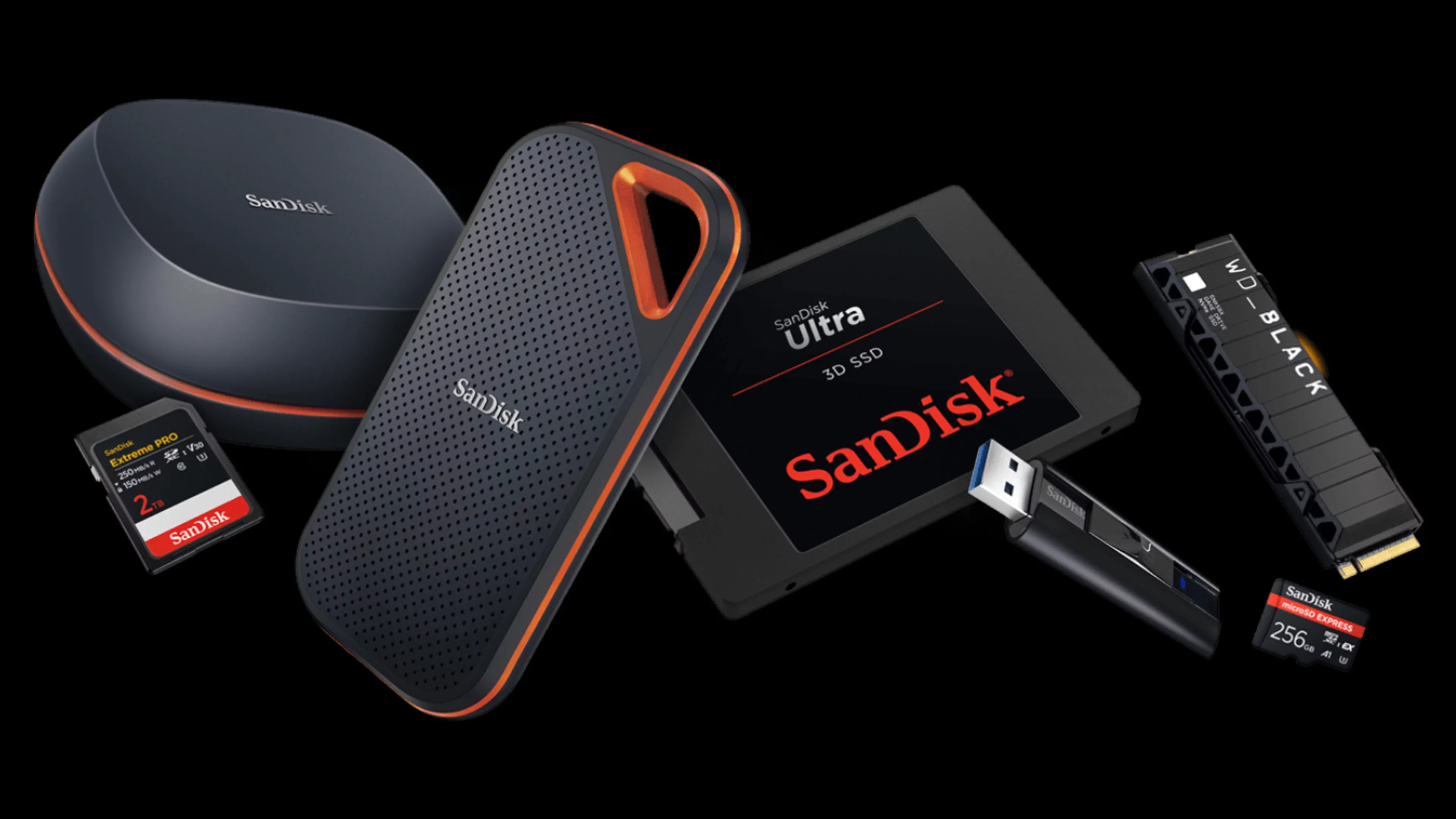
SanDisk's renewed independence marks a thrilling chapter for SSD storage. Tech enthusiasts can anticipate faster innovation and competitive pricing in SSDs. This means cutting-edge tech tailored for high-performance builds. Expect advancements in speed, durability, and customization, crucial for upgrades. SanDisk's focus promises exciting possibilities for tech-savvy consumers.

Click to read more Tap to read more
cost per gigabyte as an indication of ssd value blog | diy ssd

Cost per Gigabyte as an Indication of SSD Value

March 10, 2025
| The Workshop

Cost per gigabyte is key for evaluating SSDs as tech advances and prices change. For those building PCs or seeking performance, it's a basic way to compare SSDs. Mainstream PCIe 4.0 NVMe SSDs average $0.06-$0.08 per GB for 1-2TB, a big drop since 2023. This helps compare SATA and high-end PCIe 5.0 models, though speed and lifespan can make the higher costs worth it.

Click to read more Tap to read more
Previous Next
About
Privacy
Terms
© 2024, 2025 - All Rights Reserved
Brand Logo Icon | DIY SSD