SSD Comparisons & Price Tracking
No affiliate links. No marketing BS. Just the data.
diySSD is an independent SSD comparison site built for gamers, creators, and PC enthusiasts who want straight answers about storage. No affiliate links. No sponsored reviews. Just honest analysis of 750+ SSDs to help you make the right choice.
Find Your Perfect SSD
Latest Buyer's Guides


Storage News & Analysis


Discounted Products
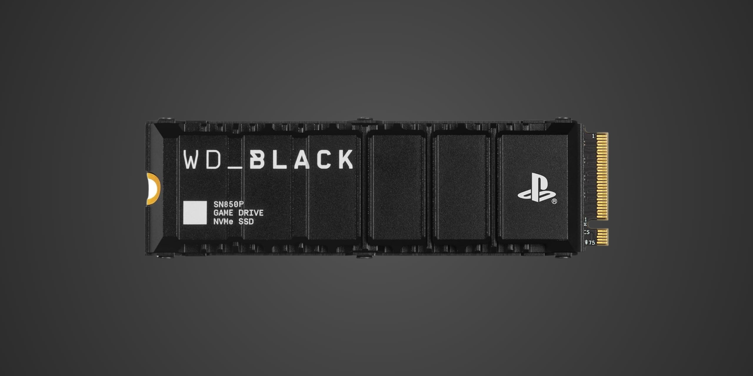
65% OFF / SanDisk WD_BLACK SN850P - 2 TB (w/HS)
Est. Price
$379
Price Context
Lowest in ~1 month ($299)
Pricing Trend
→ Stable
$/GB
0.19
Retailer
Best Buy
Performance
7,300 MB/s read
Price Validated
Jul 20, 2026

62% OFF / SAMSUNG 870 EVO - 2 TB
Est. Price
$399
Price Context
✓ Lowest tracked price
Pricing Trend
↓ 41% vs last cycle
$/GB
0.2
Retailer
Amazon
Performance
560 MB/s read
Price Validated
Jul 20, 2026
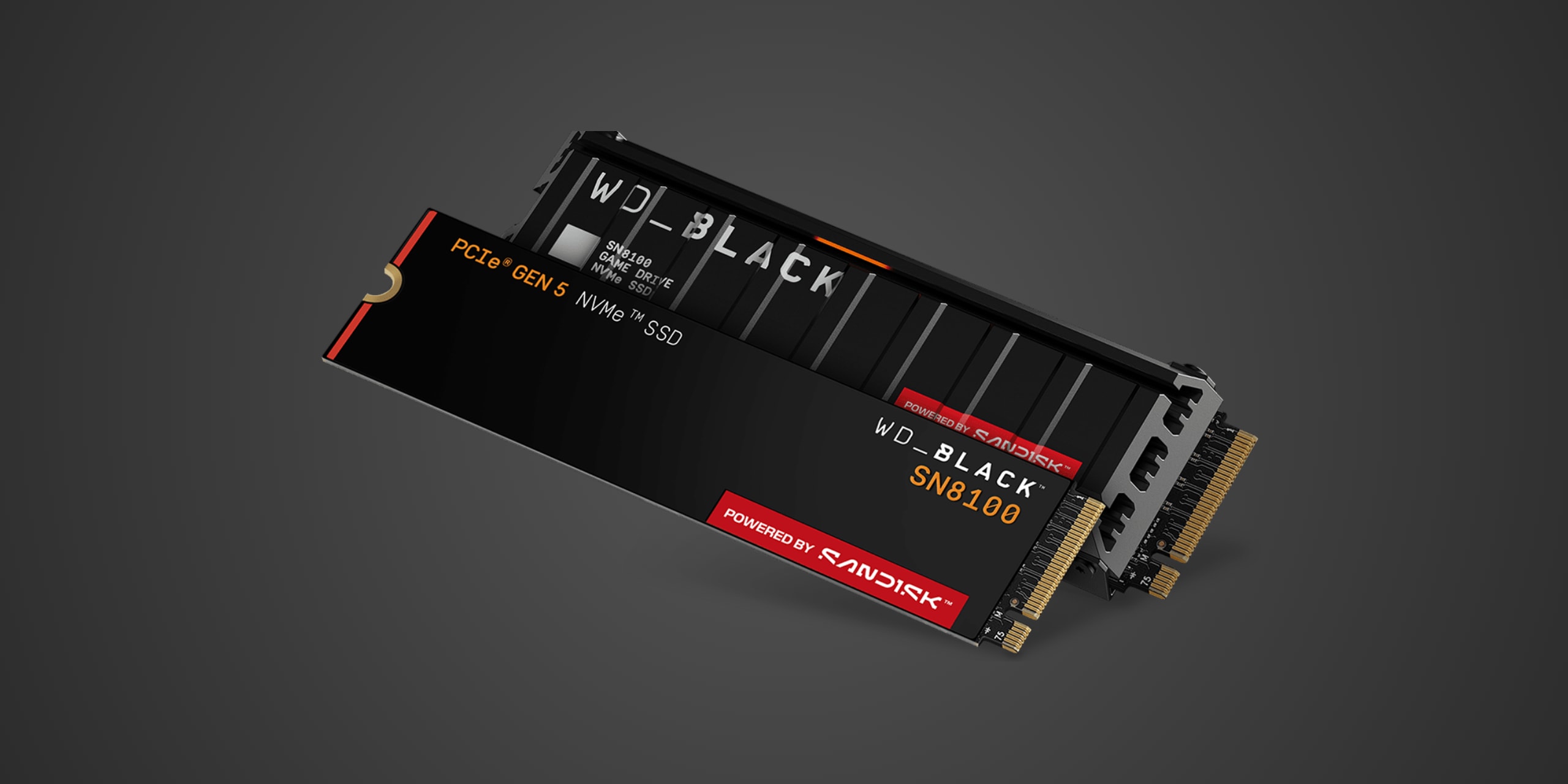
56% OFF / SanDisk WD_BLACK SN8100 - 2 TB
Est. Price
$399
Price Context
✓ Lowest tracked price
Pricing Trend
→ Stable
$/GB
0.2
Retailer
SanDisk Direct
Performance
14,900 MB/s read
Price Validated
Jul 20, 2026

56% OFF / SanDisk WD Blue SA510 2280 - 2 TB
Est. Price
$279
Price Context
✓ Lowest tracked price
Pricing Trend
→ Stable
$/GB
0.14
Retailer
SanDisk Direct
Performance
560 MB/s read
Price Validated
Jul 20, 2026
ℹ Advertisement
Why Trust diySSD?
Independent
No affiliate commissions or sponsored content
30+ Years Experience
Real-world technical expertise
750+ SSDs Tracked
Comprehensive comparison database
Regular Updates
Fresh prices and content monitoring